Flat: Sincerely
Flat is the renewed brand of the Finland Snowboarding Association, celebrating the sport and pushing it toward new heights. Werklig acted as a strategic and creative teammate, distilling the spirit of freedom into a clear strategic foundation and shaping the sport’s creative, cheeky culture into a strong yet sincere verbal and visual identity.

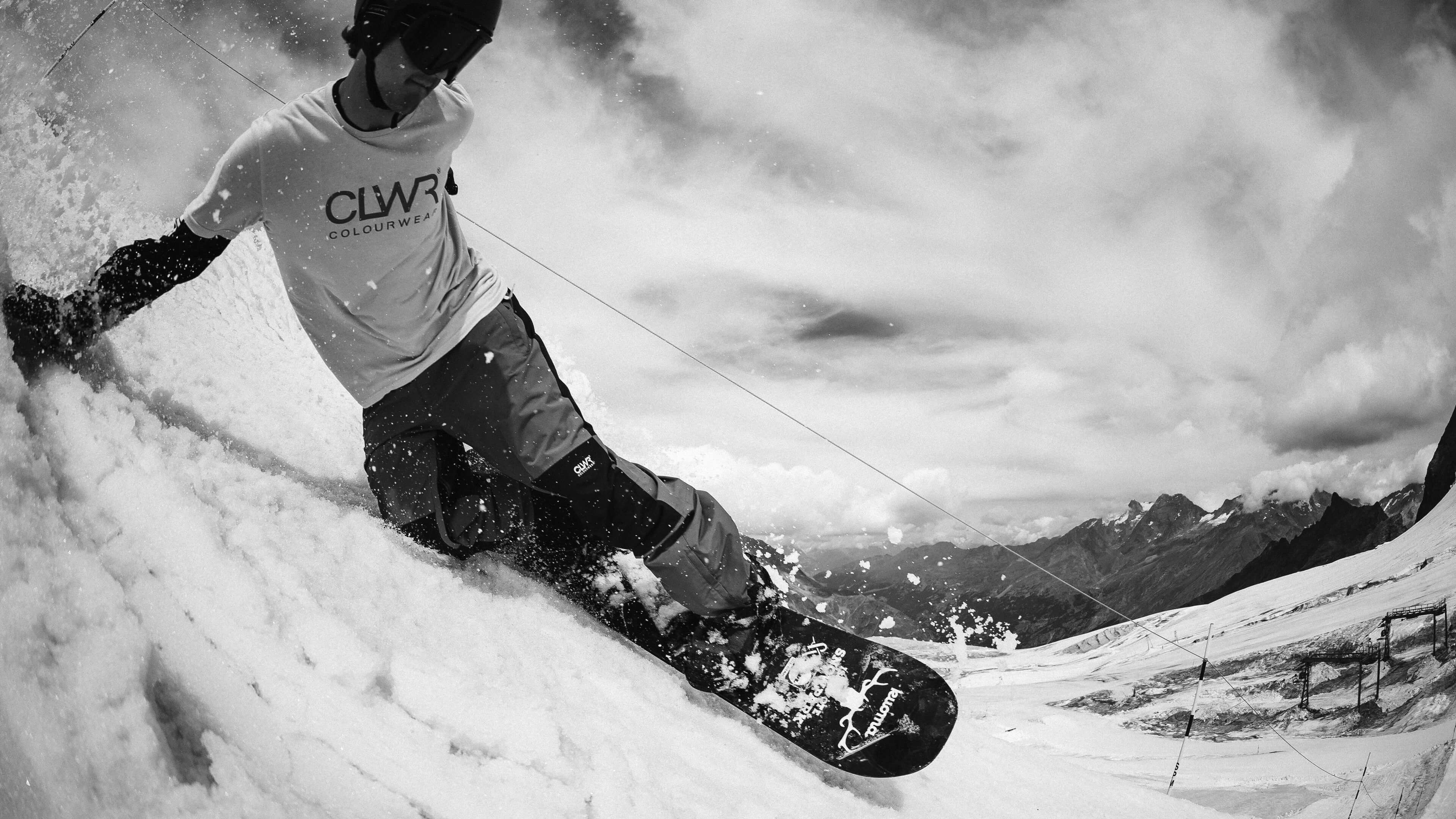
Deep down, snowboarding is a team sport. Although you ride solo, it’s a house of like-minded people cheering when you stomp that first 360 and picking you up with a healthy dose of banter when you slam. Snowboarding has also evolved from being a group of misfits causing hassle into a competitive Olympic sport.
The Finland Snowboard Association wanted to capture this free-spirited culture and better reflect the values of snowboarding and riders — the joyful anarchy and creativity — in a way that does justice to the elevated status the sport has rightfully claimed. Werklig was appointed to carve the new brand that would become your favourite snowboarder’s favourite association.


When dealing with a sport with a rich culture and radiant image, it’s easy to fall into the “cowabunga dude how-do-you-do-fellow-kids” clichés. Our approach, as always, was to involve actual riders in the strategy and identity work. Instead of creating a brand from the comfort of an uptown design agency, we grounded everything in the real ethos of the sport. Oh, and our CEO is a former snowboard pro, so there’s that as well.
From the guiding brand values of sincere, free and tough, Flat was born.


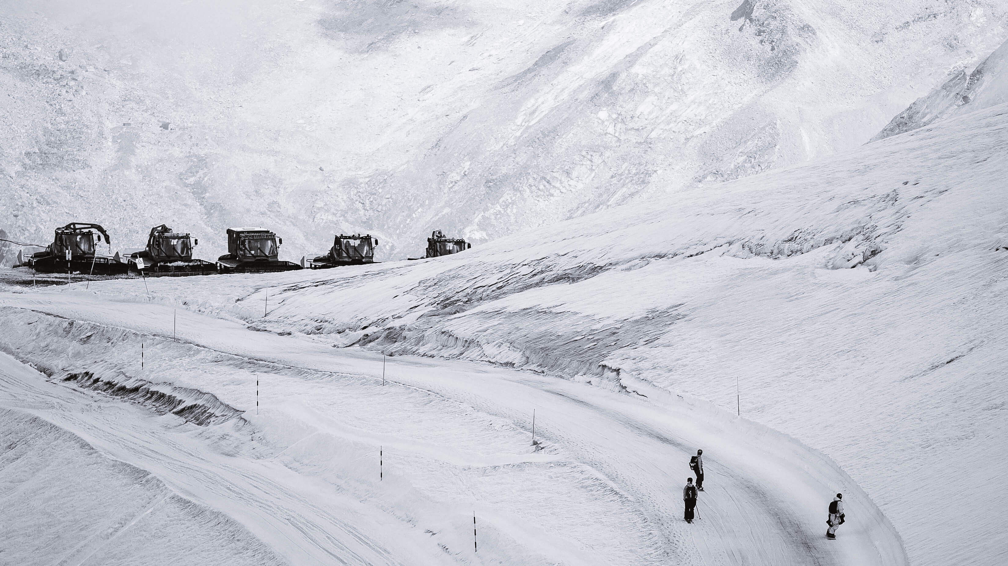
From the name onward, we wanted the cheeky attitude to be prominent. In addition to “flat” being the area you land on after overshooting a jump, it also winks at the fact that from a country that’s predominantly flat (we don’t even have a mountain that would officially count as a mountain) come some of the world’s best riders.
The movement of the logo is an endless bag of tricks as the characters follow the motion of different moves. The brand colour pink is sourced from the idea of powder, fresh snow and make-up. The “official” symbol creates a sense of authority while simultaneously taking a stab at anything established. Flat’s identity captures the essence of being joyfully serious and sincerely real, finding new lines, meanings, and motion.

A clear three-column grid that can be flexed and flipped as needed.

The colors of Flat fuse an electrified Finnish flag blue with a "powder" hue.

Like the sport itself, the identity is meant to be used, tweaked and owned


Although the sport has become mainstream, it still has a veil of mystery. It’s hard to explain to a non-boarder why one grab is cleaner than another, why something sloppy can be good, and why the hardest trick isn’t always the best.
Flat embodies this independent, rider-led mindset and creates a space for all like-minded to tag along. It’s less of a brand and more of a home for a community — one that verbalises and visualises the culture while giving room for creativity and expression to evolve.