
Suprey: Evolved nutrition
Suprey is a new Southern European supplement brand built on a single insight: everyone can benefit from a nutritional boost — not just the already jacked and performance maximisers. From brand strategy and naming to identity, messaging and packaging design, we helped Suprey become an evolved nutrition company, on a mission to build a resilient home for every soul.
The supplement market has many subs — from testosterone-filled maximisers to earth-loving alternatives. Suprey isn’t either. They needed to communicate effectiveness grounded in good science (this stuff actually works and is safe), while embracing the joyful side of better well-being for all. Getting across a positive message: you don’t need to live at the gym to care about health and resilience. It doesn’t need to taste bitter to make you better. Everyone should have their particular needs taken into account — without extortionate cost.
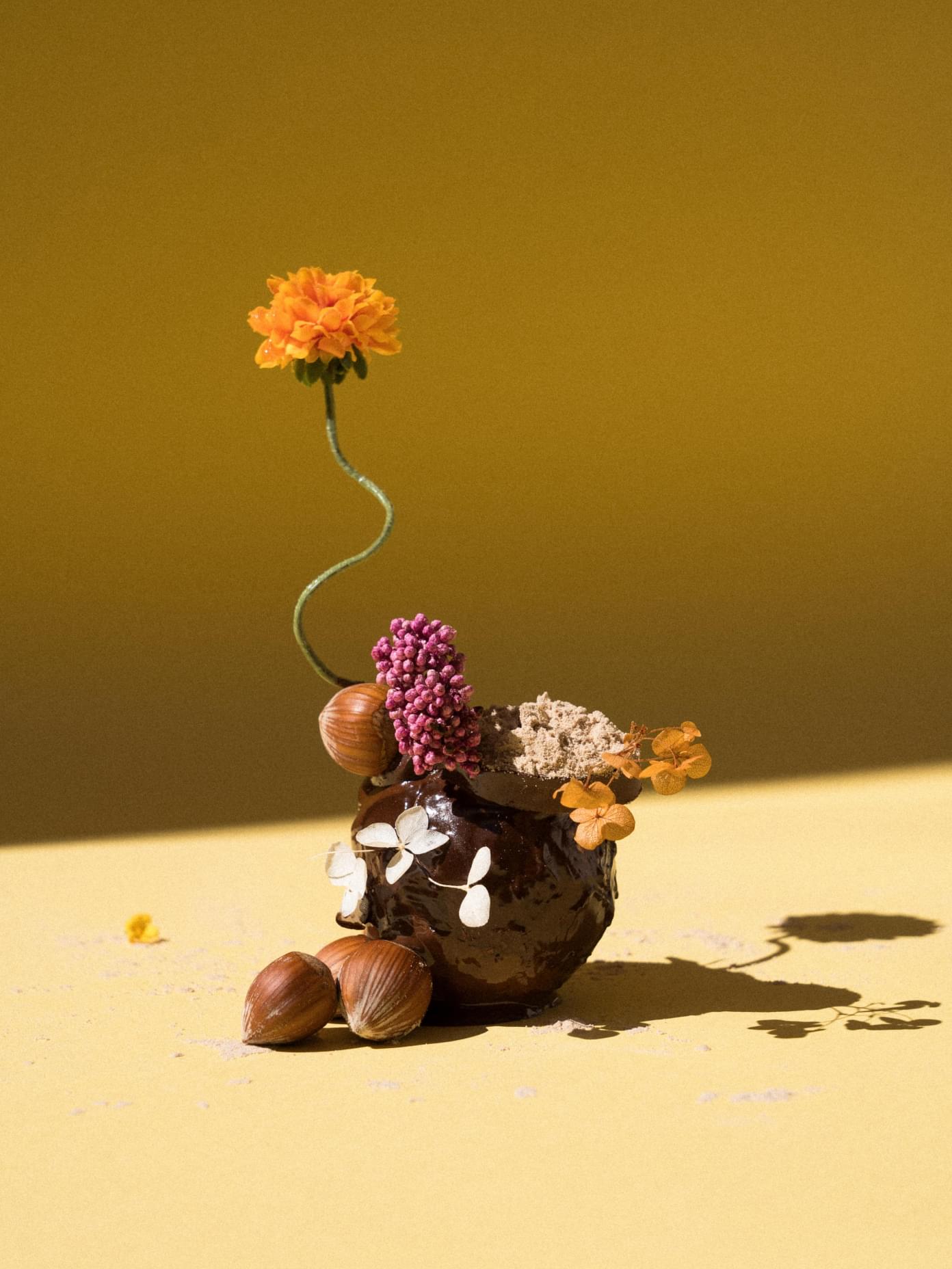
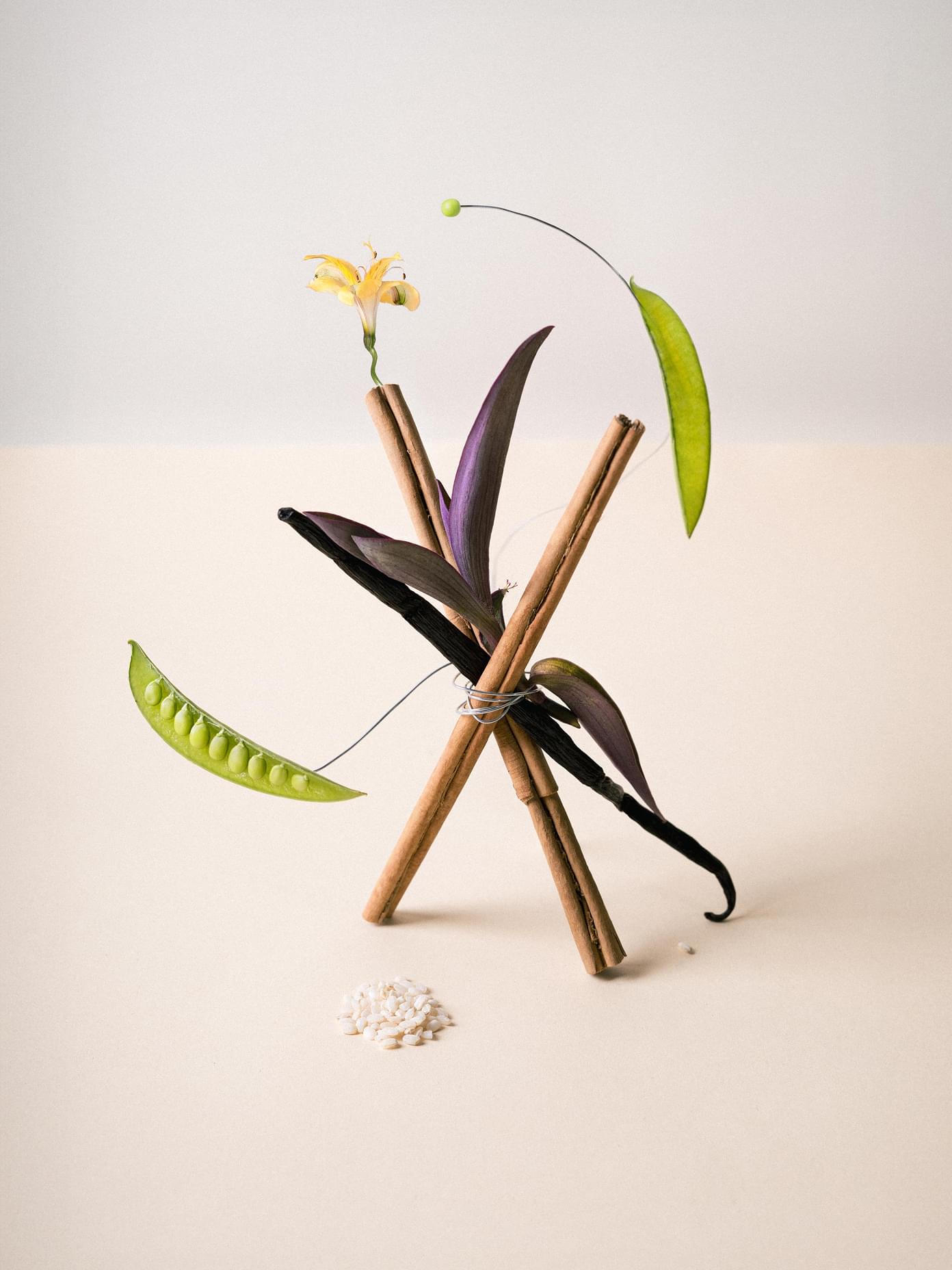
Obliged to their grandmothers to carry forward the cultural ethos of the South, Suprey believes food is not fuel — it’s one of life’s pleasures. This age-old wisdom was brought into the formulas through collaboration with a world-class food scientist and connoisseur of taste.
The brand’s values of joy, tenacity and a pioneering spirit formed the blueprint for how evolved nutrition should be expressed — scientifically credible, culturally rooted and genuinely enjoyable. Exclusively inclusive.
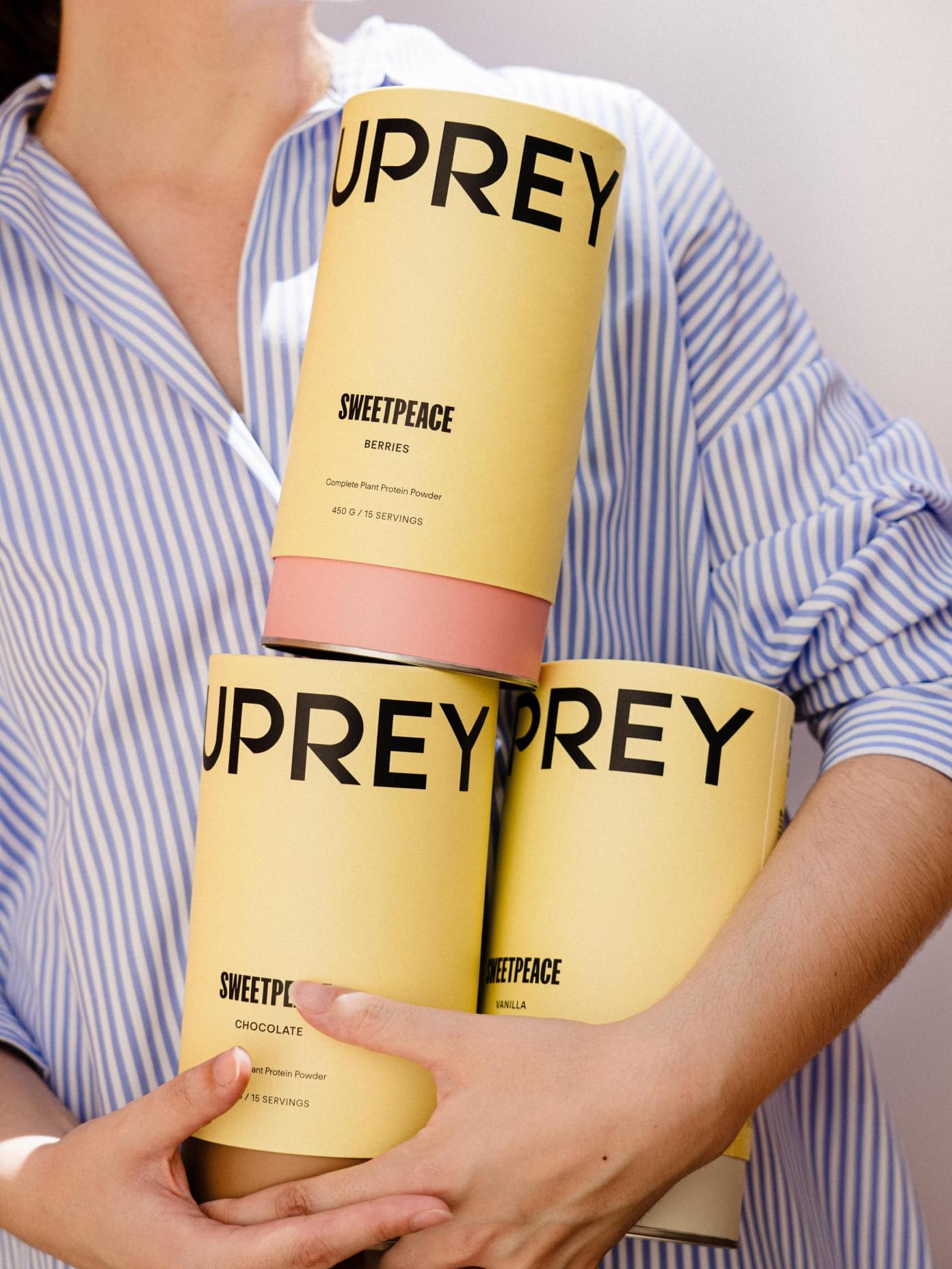

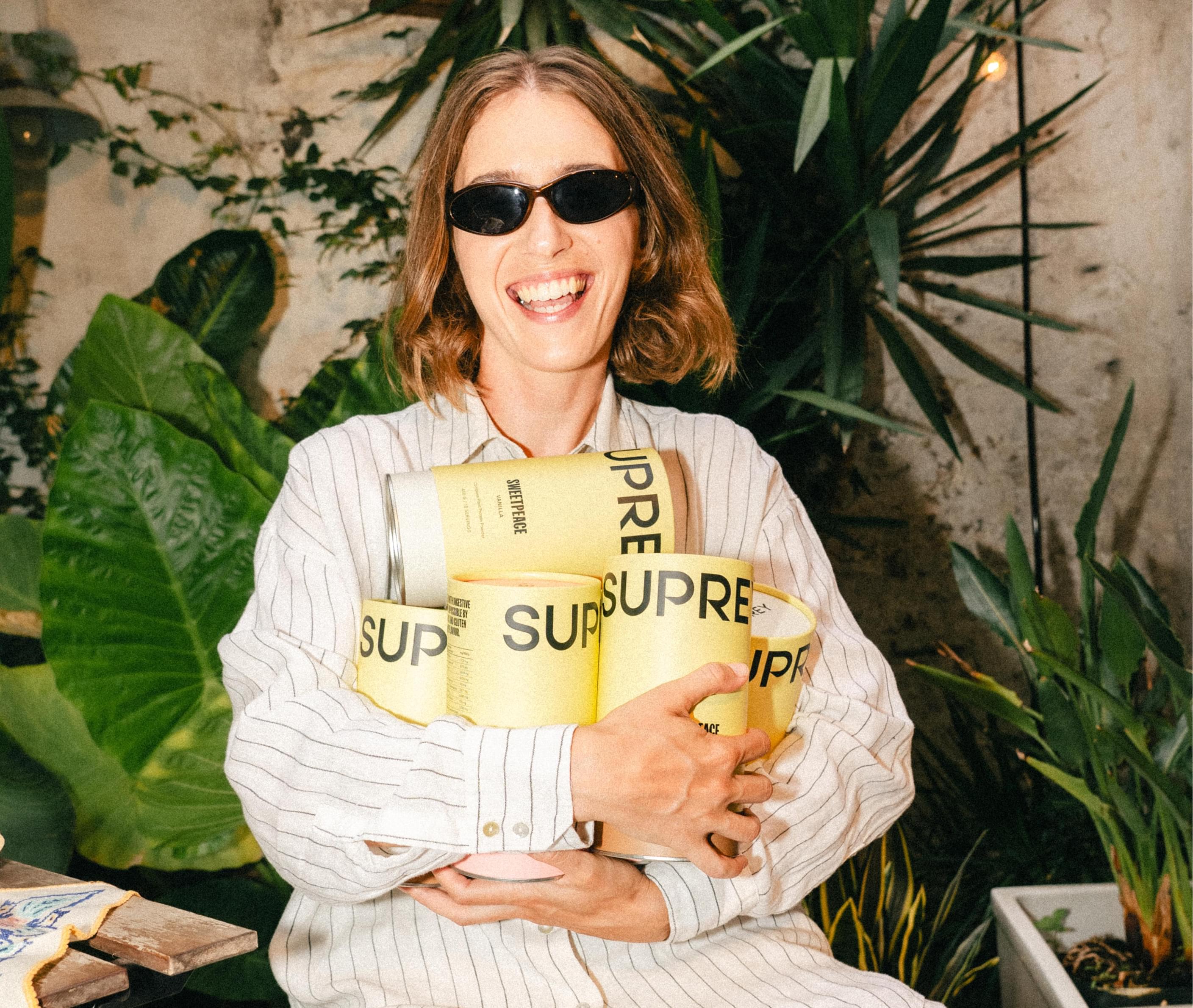
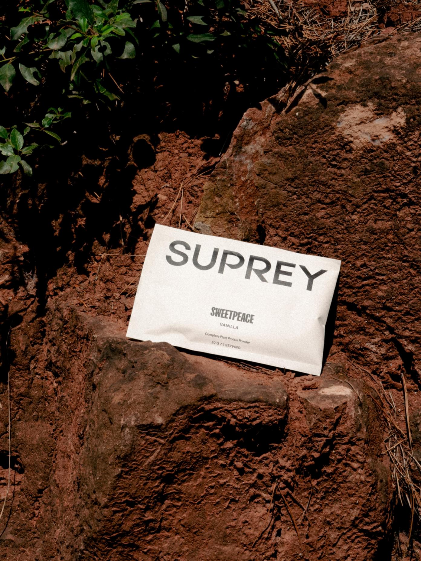
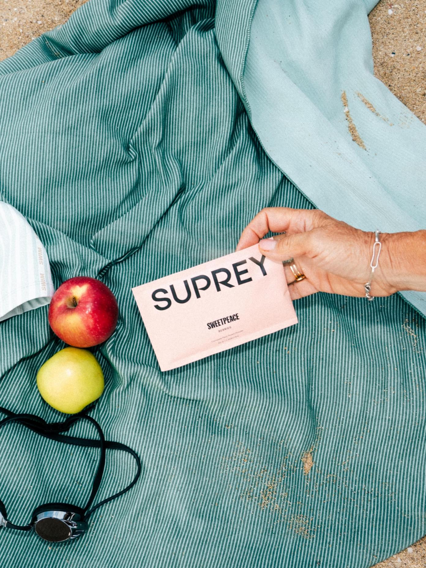
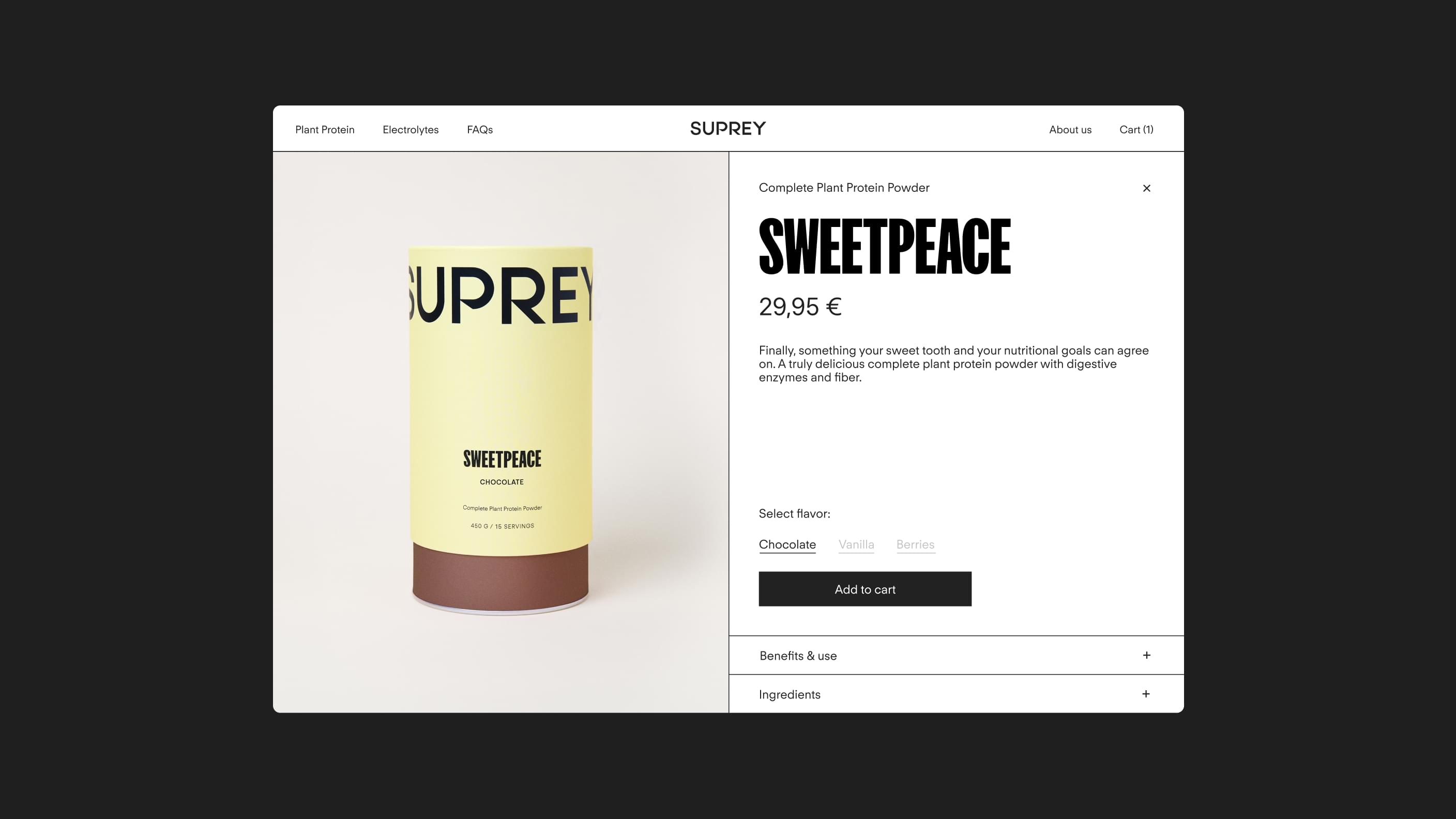
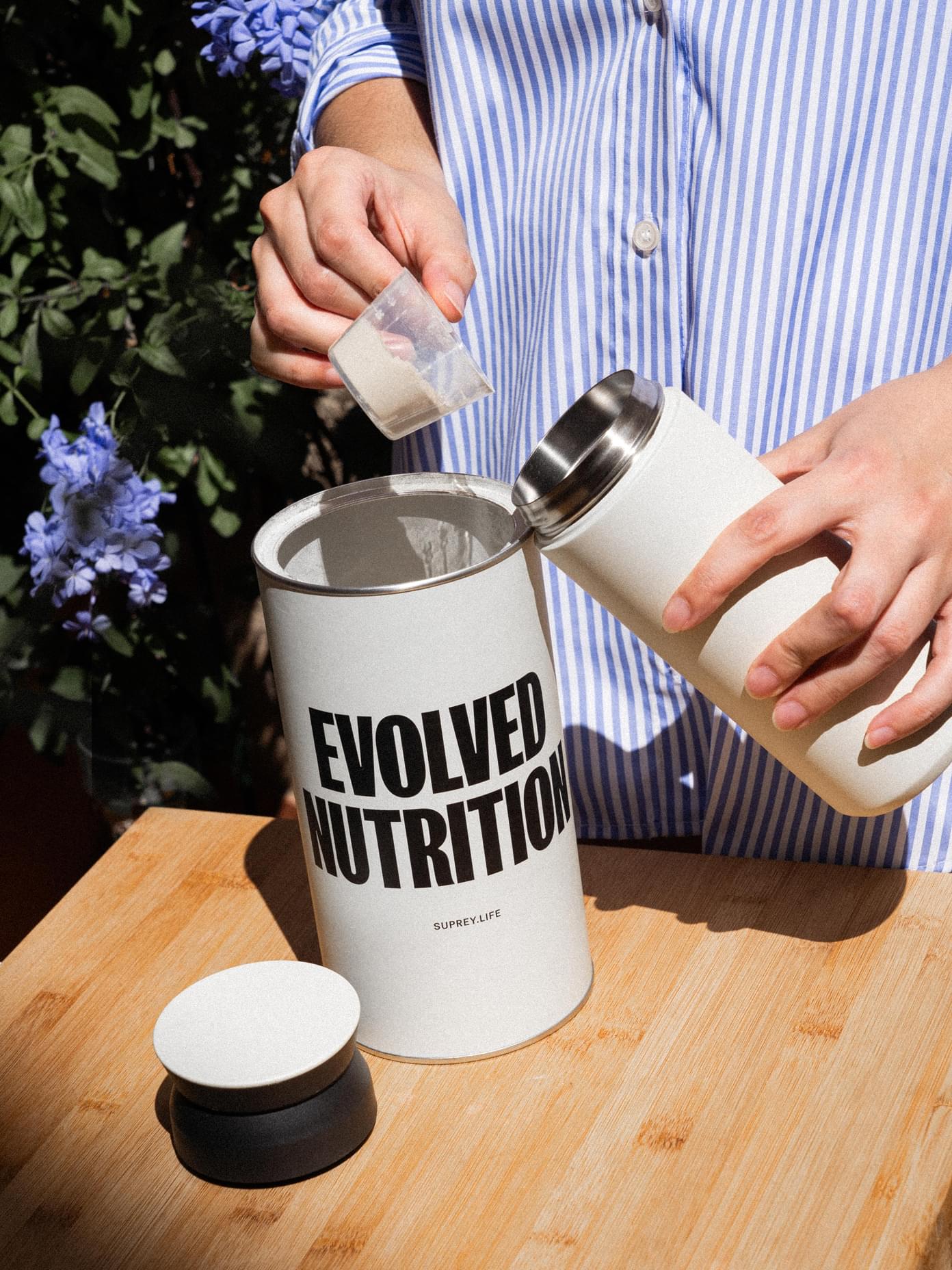
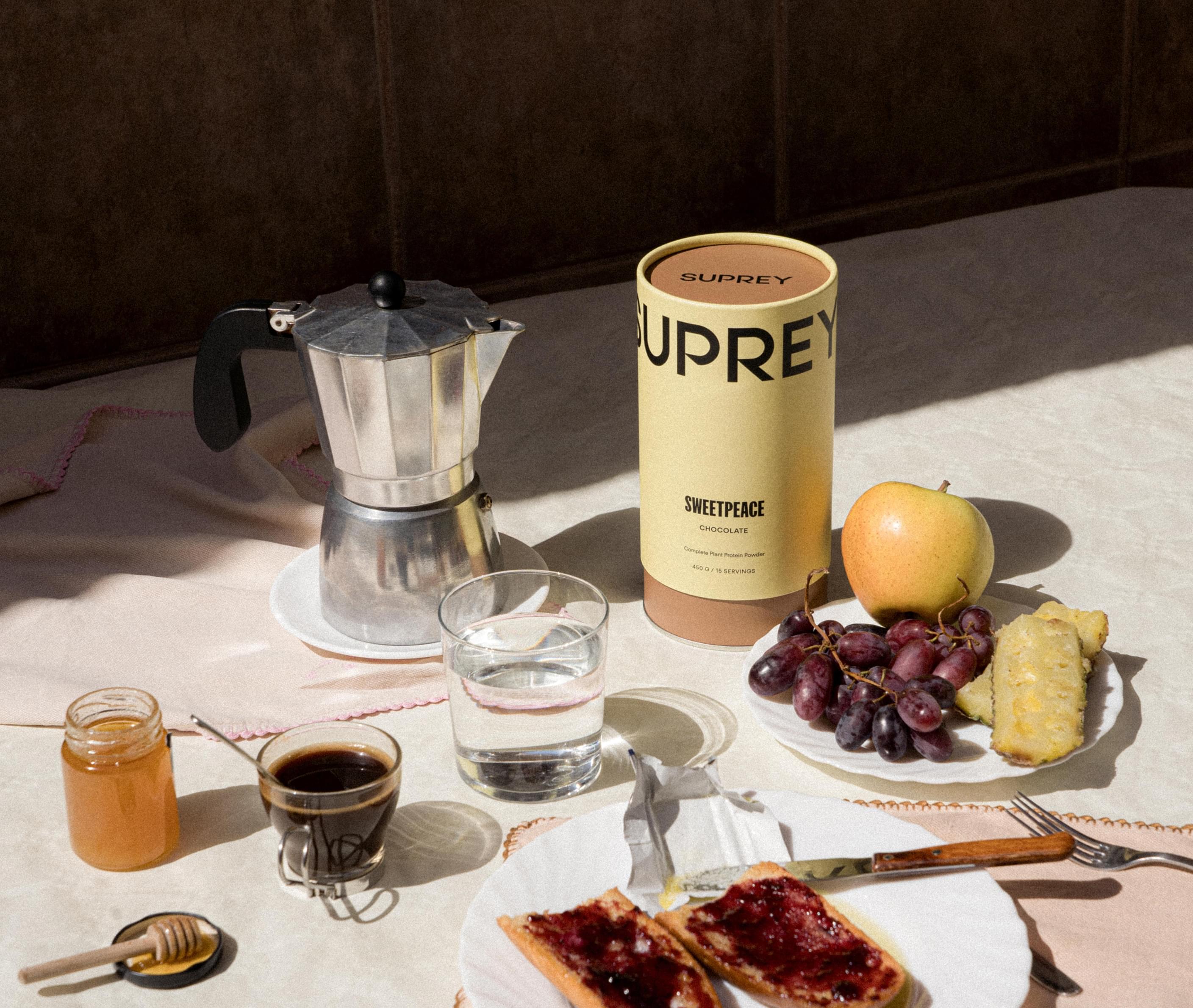
Designed to live on a shelf at home rather than in the gym, the color scheme is sophisticated and vibrant. Carefully sourced packaging, from shapes to colors and materials, is a delight to pick up and open every day. Minimalist but bold typography conveys the science behind the joy.
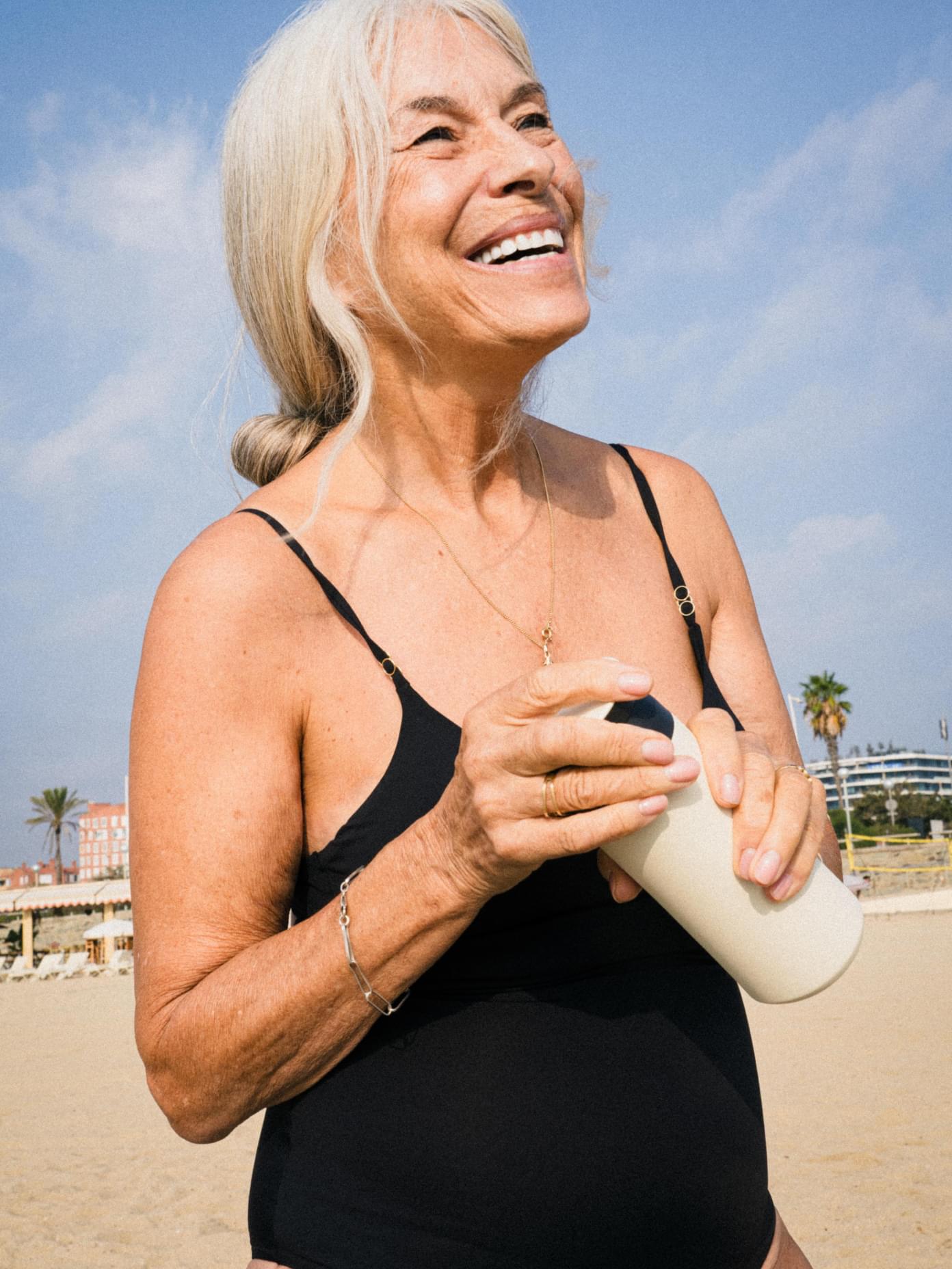
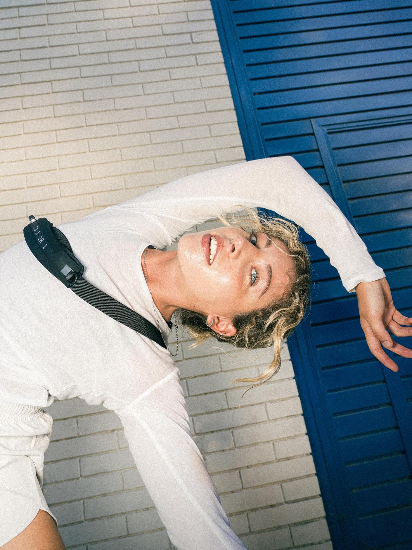
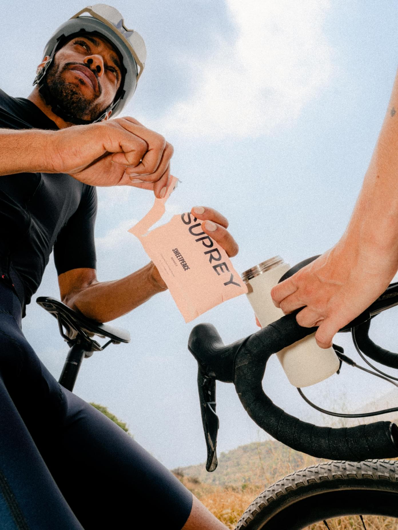
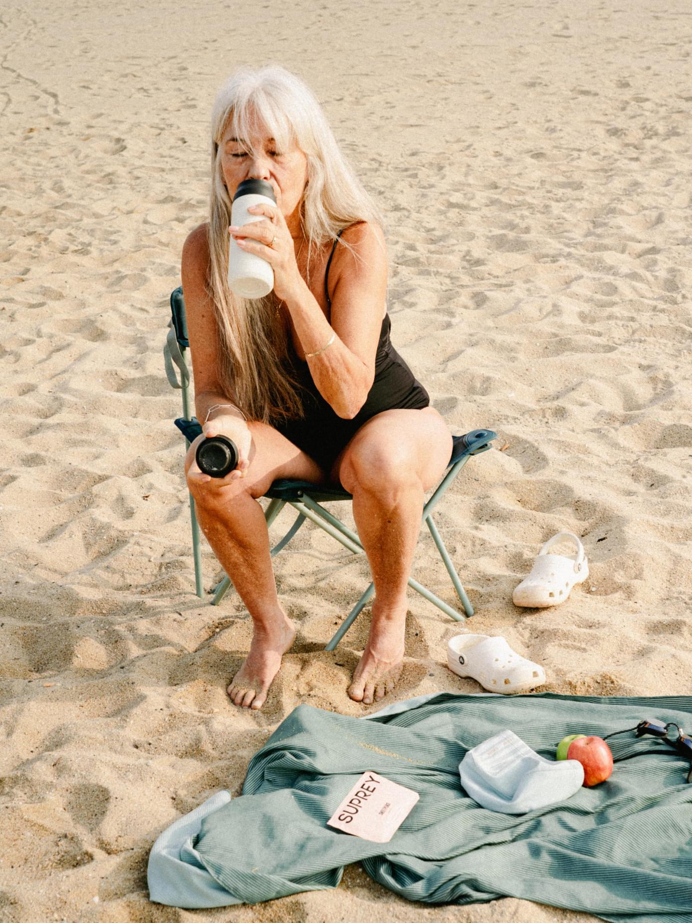
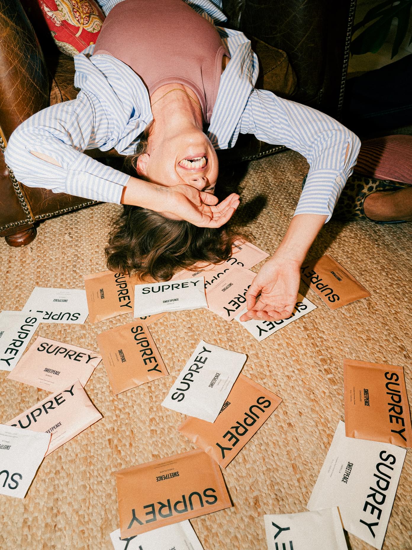
Names such as Sweetpeace and Hydust wink towards chemistry and formulas without forgetting the spirit and fun. Imagery narrates the brand’s community — people of all shapes and ages, who want to enjoy life as long and as much as possible.
You can't see us in the pictures, but the fun we had accompanying Suprey on the photoshoot in Barcelona might come through...
The evolved brand positioned Suprey clearly outside traditional supplement categories, giving them a distinct place in a crowded market. By balancing scientific credibility with warmth, joy and cultural relevance, Suprey launched with a brand that feels both trustworthy and inviting — built not just for performance-driven users, for all kinds of people, bodies and ages. So far, the design and taste have delighted customers, all at an accessible price.
The clarity of the brand system has enabled Suprey to build a coherent product family and continue growing with confidence.
“Werklig managed to make reality the dream that we had in our minds. The connection and collaboration between Madrid and Helsinki was smooth, enjoyable and insightful throughout.”
— Isabel Rodriguez Calvet, Co-Founder
We continue to work closely with Suprey as they pursue their plan and bring new supplements to the market, ensuring a clear creative vision while Suprey keeps doing what they do best: evolving.

Scope
- Brand strategy
- Naming
Identity
Stories
Art direction - Packaging
Web design
Partners
Toro Studio